The challenge
Tuenti, Movistar’s prepaid carrier division in Argentina, had a form on their website for new clients to request Free SIM Card Delivery. The very beginning of their client relationship. They came to us saying they were having very low conversion rates and shared with us an Analytics Report from another vendor, which included Heat & Click maps, and identified 4 fields where they were loosing over 55% of their visitors. It offered only assumptions as to why.
The work
I audited the form, determined it’s 9 fields, their related options and looked for any evident Heuristic issues. At first glance the form was hidden below the fold, yet analytics showed that users fell through later on in the flow so I remained on the task. It was not the simplest form I had ever encountered but I managed to request a SIM Card, had it sent to the Agency and received it almost a week later. My initial hypotheses was that too much information was being requested upfront just to order a SIM Card, specially if they had to wait almost a week to receive it and continue with the onboarding process. We told them we would conduct User Testing and come back in 3 weeks to shed more light onto their readings and help them figure out why they were seeing such a bounce rate.
The Original Page 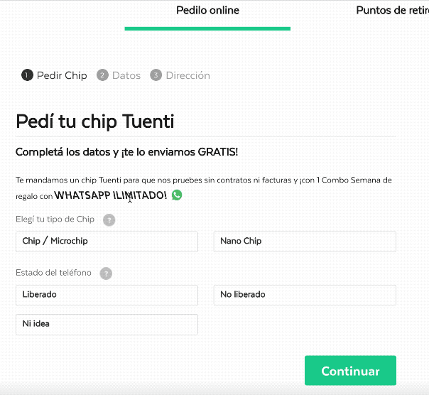
The Original Form
On week one, I proceeded to set up user tests. Since we were being proactive, I screened and recruited 20 candidates within the agency, who weren’t already Tuenti clients, and where also comfortable around at least one of multiple mobile or desktop platforms to make sure I covered most of them. I also worked with our IT department to make sure I had all the technology available and working. I scheduled tests at a 4 per day rate in order to concentrate all testing during week two. Since I would be a 1 man testing unit, I needed time in between tests to debrief, make notes, download and collect all the material, reset the devices, and setup the following test. To conclude the week I wrote the test script, put together a guide presentation, and printed all the necessary materials.
During week two, some candidates fell through but I managed to run 15 tests total. Each test was arranged in 3 stages. A Pre-Test interview to understand comfort with technology, their level of experience with similar flows and what they considered a good or a bad experience. A Scenario based test where I provided the user a reason or purpose to perform the task being tested, and asked them to speak their minds out loud, as they were going through the task. In all cases I clarified that the test subject was the form and not them, that I would not be providing them with any clues or answer any questions, that they would have to tell me when they were finished, even if they decided to cut the task short and that there were no correct or incorrect answers. Finally, a Post-test questionnaire where I would have them evaluate what their experience was. I used a standard PSSUQ and asked them afterwards what the best and worst highlights of the experience were. If we had enough time, I would also ask them to think about how they would expect the ideal experience to be. All interviews and tests were recorded in order to have an accurate time measure and transcription source.
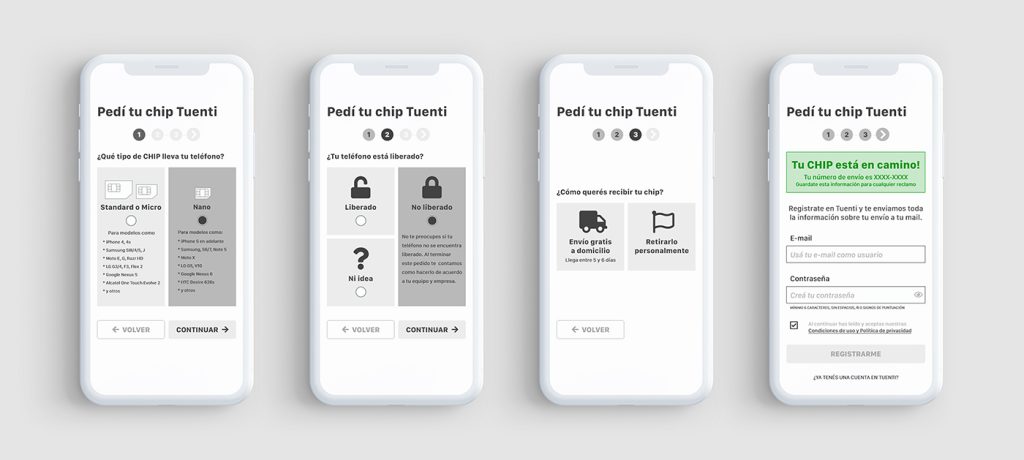
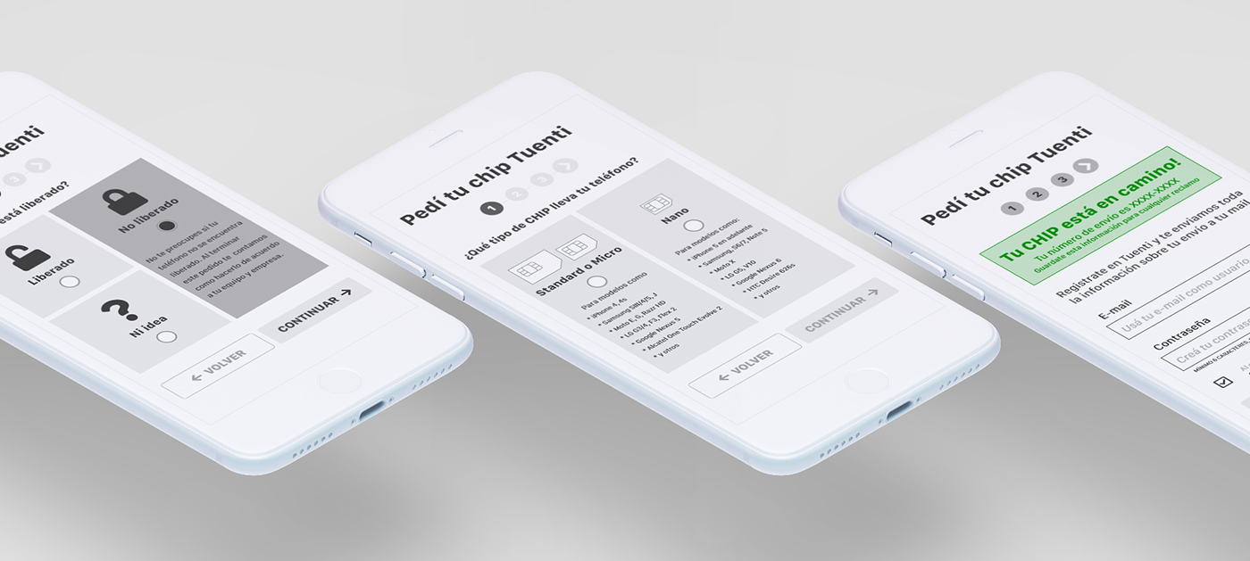
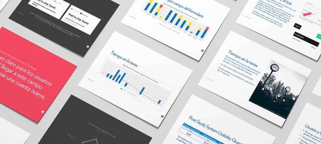
On week three, I listened to the recorded interviews and tests, transcribed the most important comments for all 3 stages of the Test, edited cuts for the most important clips, measured and created a distribution for Time on Task, measured and graphed Success Rate for each field and the entire task, and mapped the PSSUQ scores for User Satisfaction, System Utility, Information and Interface Quality to a Spider chart. I created a Report Deck, indicating imperative fixes to the form, and influenced by all the collected information, I also prototyped a redesigned form to share with Tuenti’s Team, where I split the process in two stages, “SIM Request” and “SIM Reception & Setup”
The results
My findings bore correlation to Tuenti’s data, yet I did find a clear culprit for the drop in the flow. Account creation was the error users could not recover from. The field had multiple issues, to name a few: It was not clear for users they had to create a new account in order to move forward, the password field expected a particular format but was not communicating it, the Terms & Conditions checkbox triggered a modal that could not be closed so users refreshed the page and lost all their progress. Many users failed this step and felt forced to abandon the request. Some recovered, but it took them a considerable amount of time, making the experience exhausting. This could clearly also result in abandonment. Many other usability issues were also found. All fields in the form triggered some sort of user misunderstanding, CTAs below the fold, unclear messaging in most of the fields, lack of error explanation, etc.
I presented my findings to the team at Tuenti with an introduction to our tasks during the previous 3 weeks, including a description of our user testing process and the previously mentioned improvement opportunities. I left them a 54 page report with all our findings to review after my presentation. They were particularly surprised by the time it took some users to complete the task and impressed by all the information we had gathered around the form. It aggregated on their existing information and allowed them to make conscious design decisions moving forward.