The challenge
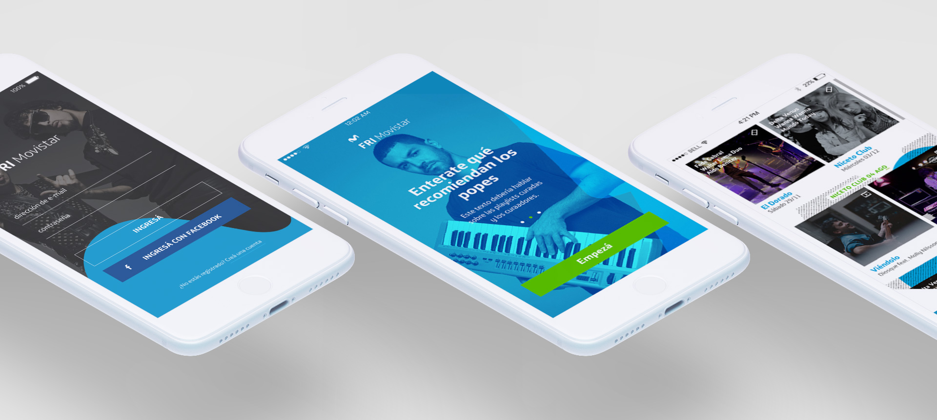
Movistar Argentina was looking to create a channel where they could connect with Millennials. Ideation resulted in an application where local Indie bands would upload and publish their songs without cost, for the target audience to consume from. Movistar would pay royalties to the bands and provide the service for free to their clients. So we set out to Design and Develop both the Mobile Application and the Web Application that would allow the local artists to upload and manage their content.
The work
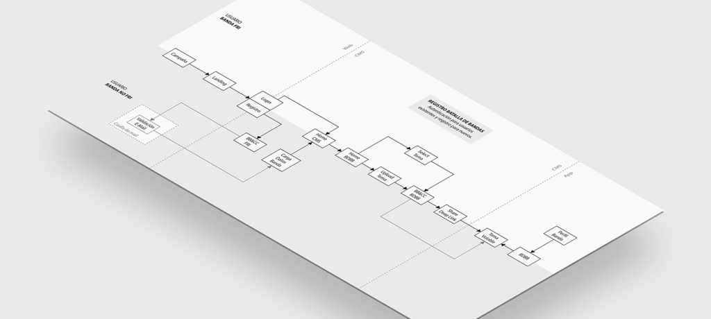
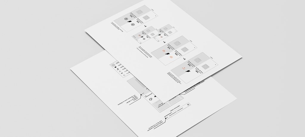
I worked with the client’s team to prototype the features, side by side with our Development team to make sure all the necessary entities had their views and all interactions were specified in documentation, and together with our Visual Designers to create a stunning User Interface. We also created a small set of reusable components like Grids, Colors, Typography, CTAs, Contextual Menus and Players, to be used as Atoms both for Design and Development.

Featuritis
As the project progressed and new potential features began to emerge, I prototyped the Onboarding, an Events Agenda, Event Reminders, Tickets Contests, a Song Contest and a Radiolike Smart Playlists, among other features, some of which never saw the light of day. I put a special emphasis on how these new features would surface within the existing sections on the App.

Greatest hit
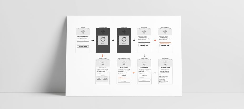
Inside their greater strategy, Movistar was also producing FRI Music, a major free Live concert. It would occur a month after development began, so we were in a rush to offer ticketing for it through the App. Usability was complex because users needed to validate their phone number against a database to verify they were Movistar customers, thus forcing an artificial hiccup in the flow of interaction. Since we did not have time to test before rollout we had to Design preemptively to fit any problems that could arise. Following only heuristics and best practices, Thirty thousand tickets were delivered, with a very small bounce rate, except for some quickly addressed minor technical issues. The client was extremely pleased.

The main learning
Because we had very little time to deliver, no research nor competition analysis was performed, nor a user acquisition or retention strategy planned out upfront. The client’s initial hypothesis went untested until months after release. Looking at Analytics and following up with online questionnaires it was clear that the intended target audience wasn’t present in the user base. As it usually happens within Marketing, products like this are considered a simple artifact inside a communication strategy rather than being regarded as a full standing product.
More learnings
A year later, after management changes and several retrospective meetings, I was able to create and run a Research Plan and it’s resulting Insights Report, involving online questionnaires and in-person interviews, that would allow us to understand where we were missing adoption from the target audience. We interviewed Heavy, Light and Uninstall users, and Non-users within the generational group to re-validate our hypotheses. Results showed us the concept did make sense within the Target audience but a mobile Application was not the best channel. Major changes required further investing, and the client wasn’t willing to pay for them. So, the project was put on indefinite hold. Learnings from the project and specially the insights gathered in research were leveraged for further engagements with Movistar.
